The Map That Made Cholera Visible
John Snow’s famous map mattered because it joined evidence to a decision.
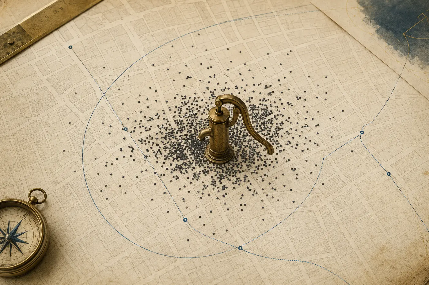
Conceptual editorial image. It illustrates the subject and is not documentary evidence.
Snow argued for waterborne cholera in 1849, then investigated the 1854 Broad Street outbreak through death records, interviews, water-use histories, apparent exceptions and comparisons between water suppliers.
Why This Matters
There is a version of the John Snow story that fits neatly on a classroom slide. Cholera strikes London. Snow plots the deaths on a map. A dark cluster appears around a public water pump on Broad Street. He removes the pump handle, the epidemic stops, and modern epidemiology begins.
The real story is more interesting—and more useful.
Snow did make a map that helped readers see the geography of an outbreak. He did urge local officials to disable the pump. But he had argued that cholera was carried in water years before the Broad Street outbreak. His case rested on far more than a picture: interviews, address lists, comparisons between water suppliers, puzzling exceptions, local knowledge, and a theory about how disease moved through bodies and cities. Even Snow acknowledged that the outbreak was already subsiding when the handle came off.
The map mattered. It did not perform magic.
That distinction matters whenever a vivid visualization is asked to carry the weight of an argument. A map can make a pattern legible. It can focus attention and move an institution to act. But a pattern becomes evidence only when someone asks what produced it, what falls outside it, what the relevant denominator is, and what rival explanations survive.
When cholera reached nineteenth-century Britain, many physicians and officials understood epidemics through some version of miasma: disease associated with foul air, decay, crowding, or unhealthy places. The theory was not simply foolish. Cholera did flourish where sanitation was dreadful, and the smells of overflowing cesspools were real warnings of dangerous environments. The mistake was causal. The odor was not the agent of transmission.
Snow, an anesthetist and physician, proposed another route. In an 1849 pamphlet, *On the Mode of Communication of Cholera*, he argued that the disease entered through the digestive tract and spread when material from an infected person contaminated food or water. This was five years before the famous Soho outbreak and before the map usually credited with revealing the answer.
That chronology changes the role of the map. Snow did not approach Broad Street as a neutral observer, plot dots, and then discover water. He arrived with a hypothesis. The outbreak offered a severe test of it.
Late in August 1854, cholera erupted around Broad Street in the Soho district. Snow obtained lists of deaths recorded by the General Register Office and went house to house. He spoke with families and neighbors. He asked where the sick had obtained water. He marked deaths near their addresses and examined their relation to nearby pumps.
The clustering was striking. In Snow’s published account, deaths crowded around the Broad Street pump. Yet the most revealing parts of his inquiry were often the apparent exceptions.
Why had a nearby workhouse, surrounded by deaths, lost relatively few residents? It had its own water supply. Why did workers at a brewery near the pump largely escape? They were given malt liquor and had access to a separate well; Snow reported that the men generally did not drink water from Broad Street. Why did some people who lived farther away become ill? Interviews connected several of them to water brought from the pump because they preferred its taste.
These cases did more than decorate a cluster. They tested the proposed exposure. If distance alone explained the map, the workhouse and brewery were awkward. If contaminated pump water was the mechanism, their unusual water arrangements made sense. Conversely, a distant death was not a contradiction if the person had consumed Broad Street water.
On September 7, Snow presented his findings to the local Board of Guardians. The next day, authorities removed the pump handle. The decision was sensible as a precaution. It also became the most cinematic moment in the story.
But the epidemic curve resists the cinematic ending. Snow wrote that the outbreak had already diminished before use of the pump was stopped. The explosive wave peaked around September 1, and attacks declined over the following days as residents fled, died, changed habits, or ceased encountering the same contamination. Snow believed removing the handle prevented possible further harm, but he did not claim that the intervention alone caused the decline. The famous act was part of a public-health response, not a clean experiment with an instant result.
The familiar map also belongs chiefly to Snow’s published reconstruction. His expanded second edition appeared in 1855. It included a map of deaths around the pump and a line marking the area whose residents were, by walking distance, generally closer to Broad Street than to another public pump. The image gave spatial form to an argument assembled through fieldwork. It helped communicate the evidence after the urgent decision had been made.
Snow’s broader evidence extended well beyond Soho. In south London, competing water companies served households intermingled in the same streets. Lambeth had moved its intake upstream on the Thames, away from much of London’s sewage. The Southwark and Vauxhall Company continued drawing more polluted water downstream. Because neighboring households with similar surroundings received water from different suppliers, Snow saw something close to a natural comparison.
He and collaborators linked cholera deaths to household water supplies. Mortality was far higher among homes served by Southwark and Vauxhall than among those receiving Lambeth water. This analysis had denominators—populations exposed through each supplier—not merely a cluster of cases. It addressed a harder question: compared with what?
The work was not Snow’s alone. The General Register Office, under statistician William Farr, provided the mortality records that made systematic comparison possible. Farr initially favored explanations tied to elevation and atmosphere, but his office built the statistical machinery Snow used, and Farr’s later analyses helped consolidate the waterborne account.
The Reverend Henry Whitehead, a local curate, also became crucial. Whitehead knew the neighborhood and its residents. Initially skeptical of Snow’s theory, he conducted his own detailed inquiries and helped trace the likely contamination of the well to waste from an infant with diarrhea at a nearby house. His local access, social trust, and willingness to test a claim strengthened the investigation. The case emerged from disagreement and collaboration, not from a lone genius converting everyone with one graphic.
There are limits to what the historical record can prove. The exact chain by which the well became contaminated cannot be reconstructed with laboratory certainty. Germ theory and identification of *Vibrio cholerae* were not yet established in British medicine. Some details in later retellings are cleaner than the archive allows.
Still, the principal distinction is robust:
- **Fact:** Snow argued for waterborne transmission in 1849, before the Broad Street outbreak. - **Fact:** His 1854 investigation used interviews, death records, pump-use histories, exceptions, and comparisons as well as spatial plotting. - **Fact:** Officials removed the pump handle after Snow appealed to them, but cases were already declining. - **Interpretation:** The map was powerful less because it generated the hypothesis than because it made one part of an accumulating case visible and persuasive. - **Informed possibility:** Removing the handle may have prevented additional infections if contaminated water remained accessible, but the surviving evidence cannot tell us exactly how many.
This is not a demotion of the map. It is a better account of what the map achieved.
The map became powerful because it organized part of a wider causal argument for institutional scrutiny. Its history shows why visualization can focus attention without proving mechanism by itself.
Therefore
The Broad Street image has endured because it compresses a complicated inquiry into a form the eye can grasp. Rows of black bars accumulate around a pump. A diffuse emergency acquires a center. In an age before interactive dashboards, the map allowed a reader to inspect the relationship between place and death at a glance.
Visibility can change institutions. Public decisions are rarely made from raw observations alone. Evidence must be organized, communicated, and connected to a plausible action. Snow’s map helped turn household tragedies into a public pattern and a theory into something officials could debate.
But visual clarity can create false certainty. A dense cluster does not by itself prove why the cluster exists. Population density matters. So do boundaries, data quality, behavior, mobility, and the choices used to place marks on a page. A case map without information about who was exposed may show where sick people were found while concealing the rate of illness.
Snow’s inquiry is powerful precisely because he kept moving between pattern and mechanism.
He asked where deaths occurred, then where people obtained water. He examined those who escaped as well as those who fell ill. He pursued distant cases that appeared to violate the pattern. He compared groups exposed to different water supplies. He joined a biological account—something swallowed and reproduced in the intestine—to observations about pipes, wells, cesspools, households, and companies.
In modern terms, he combined descriptive surveillance with exposure investigation and comparative reasoning. None of those elements was perfect. Together they were harder to dismiss.
The story also shows that evidence has an infrastructure. Death registration, addresses, water networks, local government, parish relationships, and the labor of interviewing all sat behind the famous page. Without Farr’s records, Snow’s analysis would have been weaker. Without Whitehead’s neighborhood inquiry, the local narrative would have remained less complete. Without officials capable of disabling a pump, the evidence would have had no immediate operational path.
That is a useful corrective to the idea that better information automatically produces better policy. Facts must travel through institutions. They need trusted messengers, usable formats, and a decision someone has the authority to make.
It is also a corrective to heroic history. Snow deserves his reputation because he formed a strong hypothesis, sought discriminating evidence, and communicated it with unusual force. Recognizing collaborators and pre-existing systems does not shrink the achievement. It explains how an achievement becomes consequential.
The same principles apply to the maps and dashboards used now.
A disease map can reveal a hotspot, but investigators still need to know who was tested, who was missing, what counts as a case, and whether the apparent concentration reflects transmission or measurement. A crime map can direct attention while also reproducing patterns of enforcement. An election map can make acres appear more important than people. A climate map can communicate danger while hiding uncertainty in local projections.
The right question is not whether visualization is objective or misleading. Every useful visualization selects. The question is whether its selections fit the claim—and whether the evidence behind it can withstand questions the image cannot answer.
When a chart seems decisive, inspect its denominator, timeline, exclusions, comparison group and proposed mechanism before treating the visible pattern as a settled explanation.
What Next
The next time a chart seems to settle an argument instantly, treat that feeling as the beginning of inquiry.
Ask what was measured and what was left out. Look for the denominator, not only the cases. Test the exceptions. Check the timeline: did the proposed cause precede the effect, and did the intervention occur before the change attributed to it? Seek a comparison group. Separate the pattern on the page from the mechanism proposed beneath it.
Then ask what the visualization is doing socially. Is it helping experts investigate, helping officials decide, or helping a public understand? Those are different jobs, and a graphic that succeeds at one may fail at another.
Snow’s map remains iconic because it did something genuinely important. It made part of a deadly urban system visible. Its deeper lesson is that seeing is not the same as proving. The breakthrough came from connecting a picture to interviews, records, comparisons, mechanisms, and action.
The map did not make the evidence true.
It made the evidence harder not to see.
The map mattered. It did not perform magic.
References
Sources are listed in Harvard author–date format. Links are provided where a stable public record is available.
- Snow, J. (1849) On the Mode of Communication of Cholera. London: John Churchill.
- Snow, J. (1855) On the Mode of Communication of Cholera. 2nd edn. London: John Churchill.
- Wellcome Collection (n.d.) ‘Map shewing the deaths from cholera around Broad Street’.
- UCLA Department of Epidemiology (n.d.) John Snow Archive and Research Companion.
- Tulchinsky, T.H. (2018) ‘John Snow, Cholera, the Broad Street Pump; Waterborne Diseases Then and Now’, Case Studies in Public Health.
- Brody, H. et al. (2013) ‘John Snow’s cholera: how was the evidence used?’, International Journal of Epidemiology, 42(6), pp. 1543–1552.
Further reading
- Snow’s 1849 first edition for the theory before Broad Street.
- Snow’s 1855 second edition for the full inquiry and comparative evidence.
- The Wellcome and UCLA archival records for the map, chronology and collaborators.